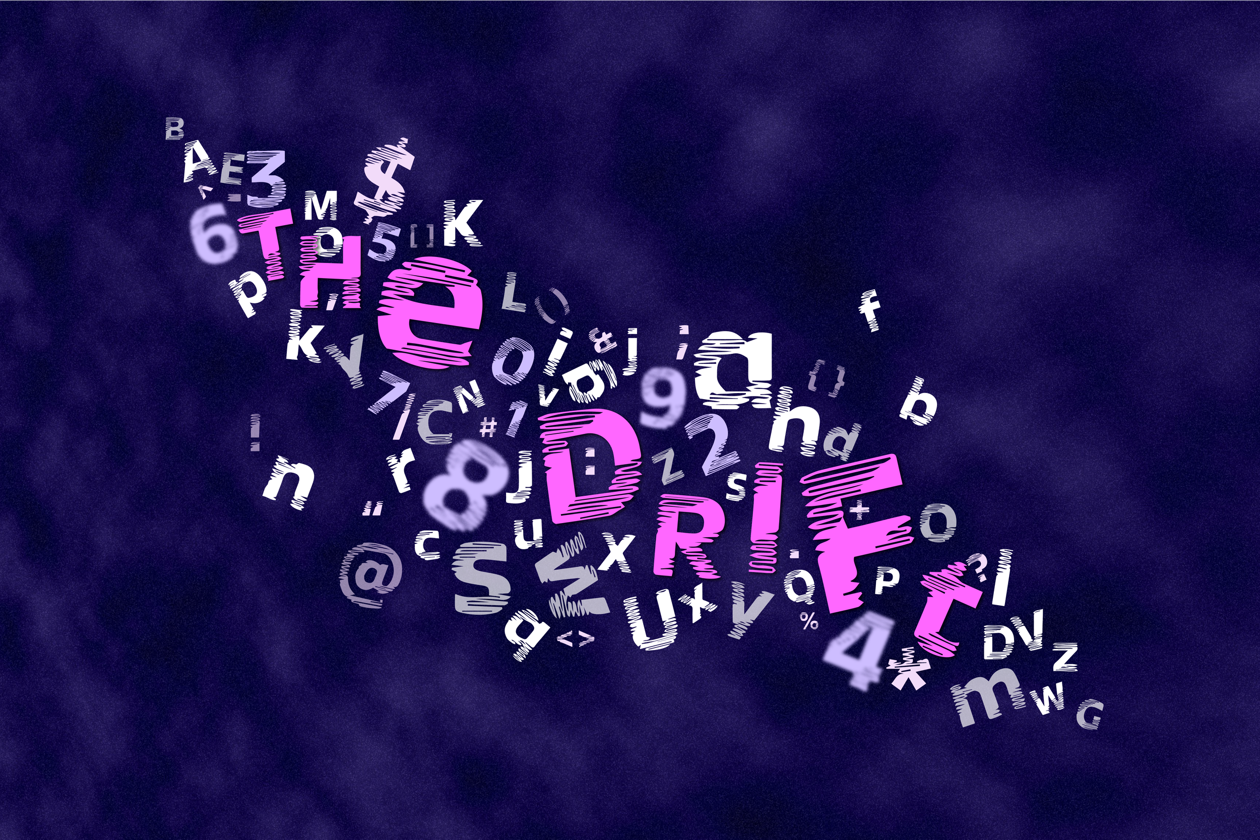
Cloud Gaze
BRAND IDENTITY - PRINT DESIGN
Project Overview
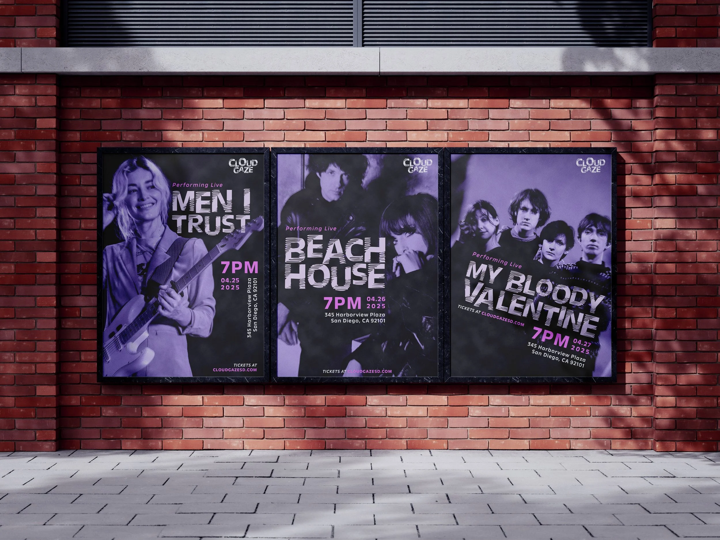
Cloud Gaze is a music venue inspired by Dream Pop genre.
Dream Pop emerged in the 1980s and resurged in the late 2000s. A sub-genre of alternative rock and neo-psychedelia, it’s defined by its dreamy, atmospheric sound.
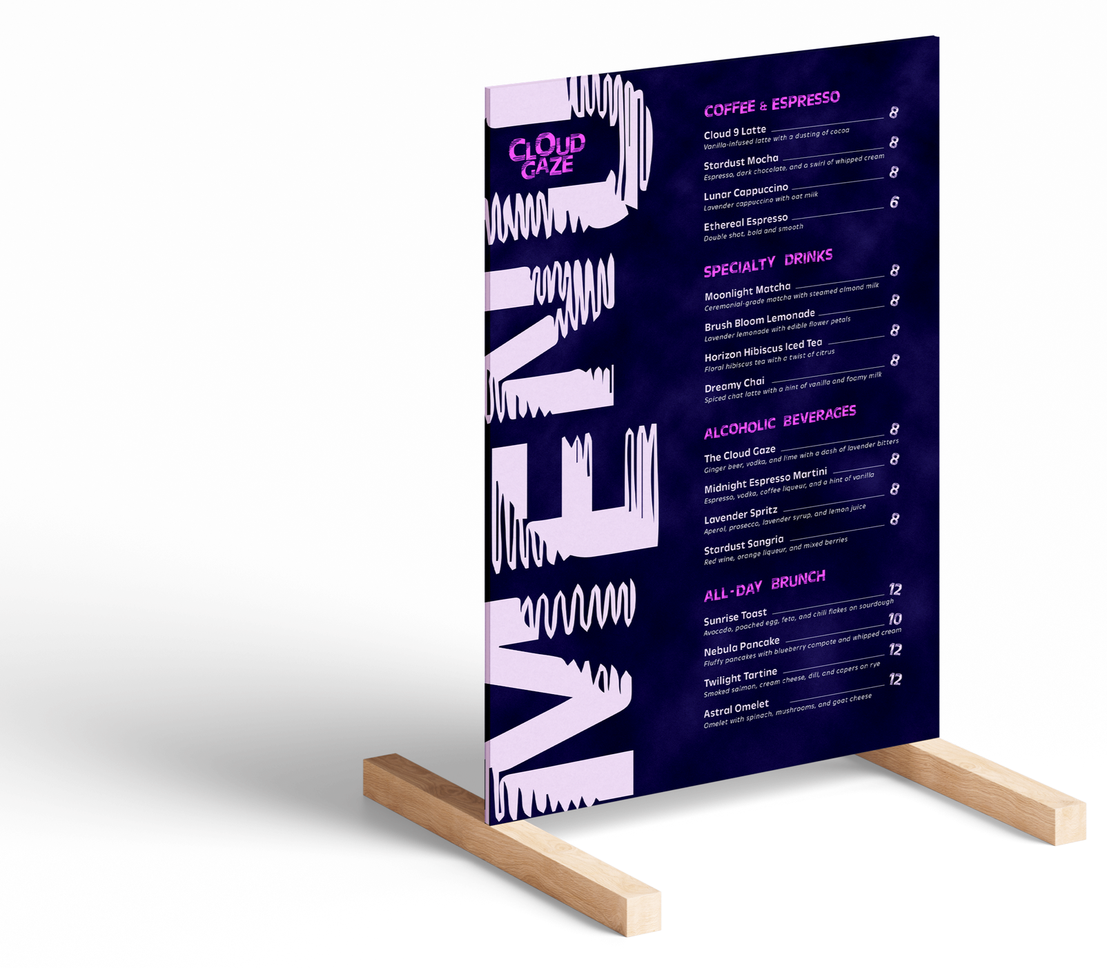
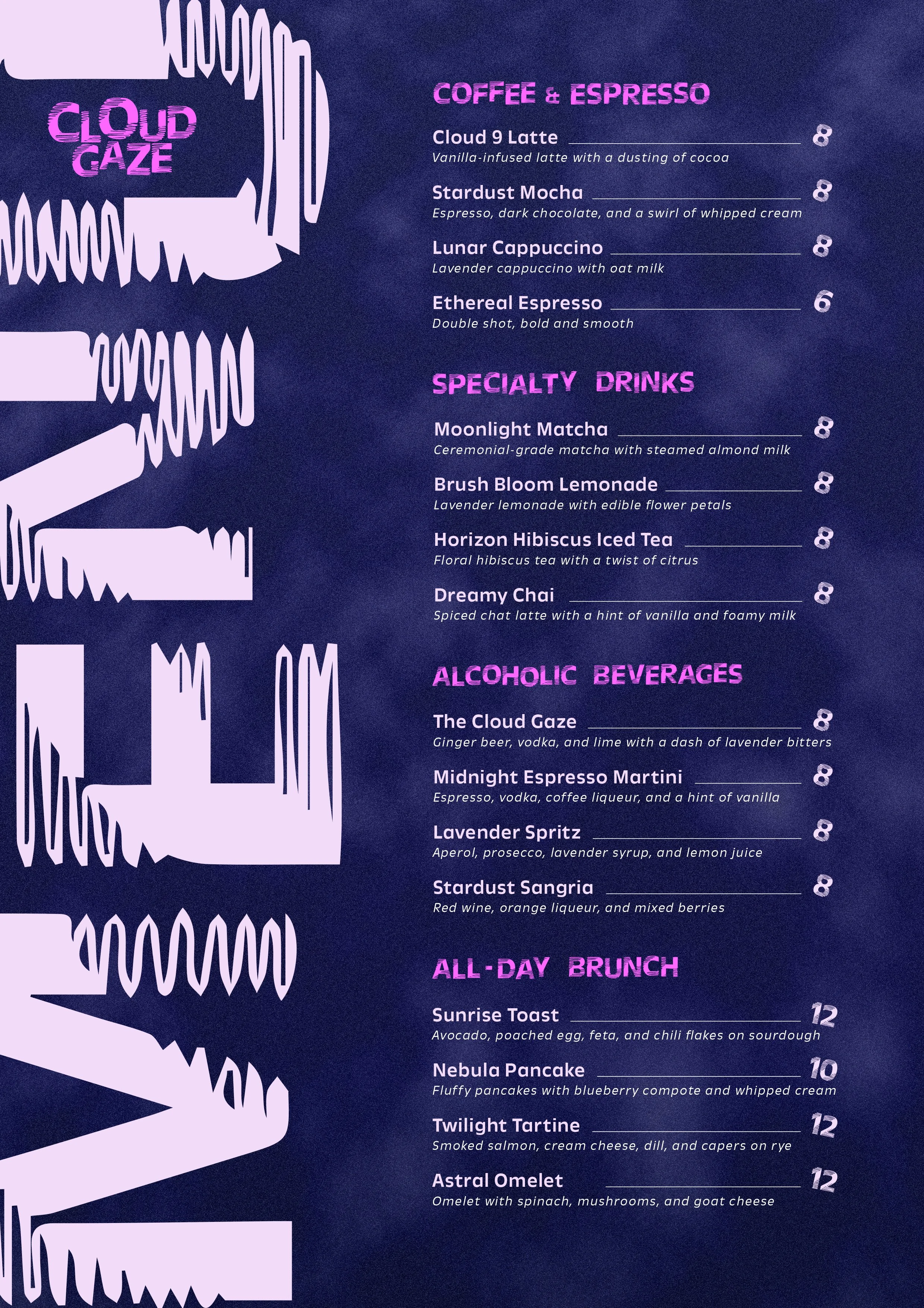
Cloud Gaze is not just a cafe, but also a music venue that is designed to transcend customers to be in a space of dream.
The History of Dream Pop
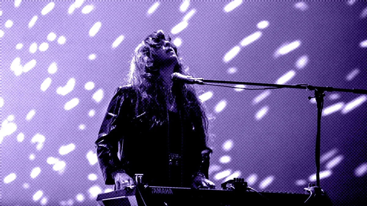
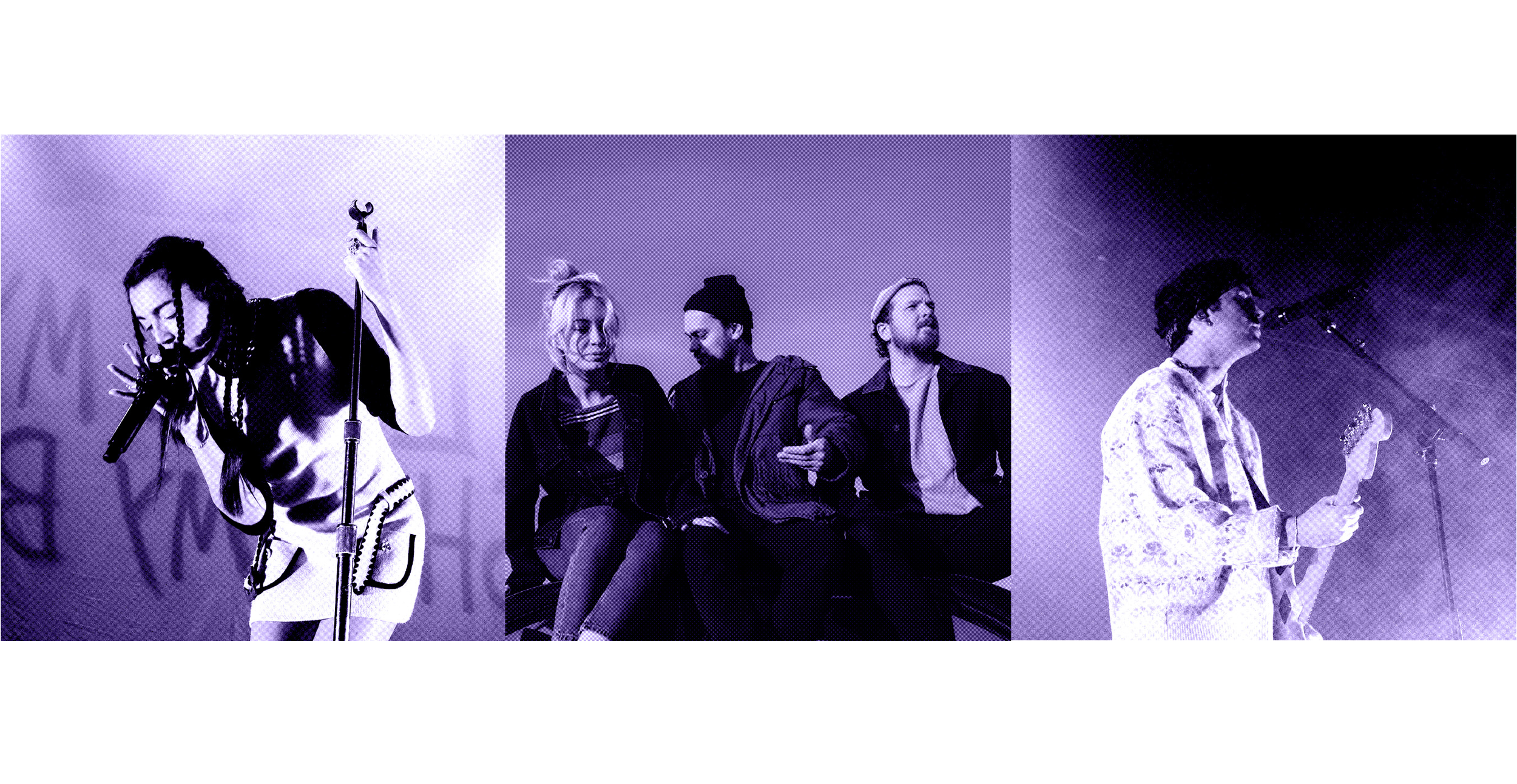
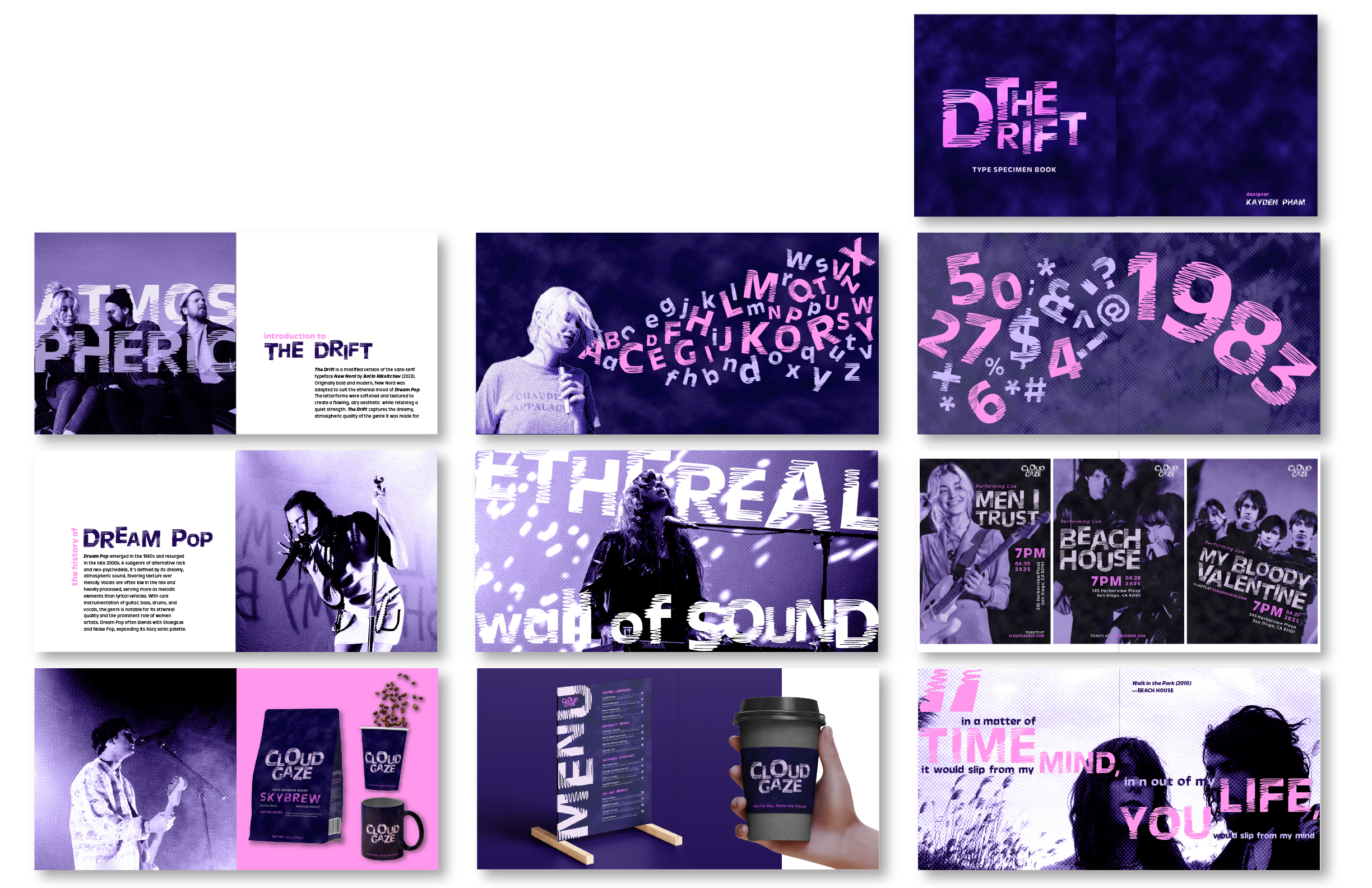
Dream Pop emerged in the 1980s and resurged in the late 2000s. A subgenre of alternative rock and neo-psychedelia, it’s defined by its dreamy, atmospheric sound, favoring texture over melody. Vocals are often low in the mix and heavily processed, serving more as melodic elements than lyrical vehicles. With core instrumentation of guitar, bass, drums, and vocals, the genre is notable for its ethereal quality and the prominent role of women artists. Dream Pop often blends with Shoegaze and Noise Pop, expanding its hazy sonic palette.
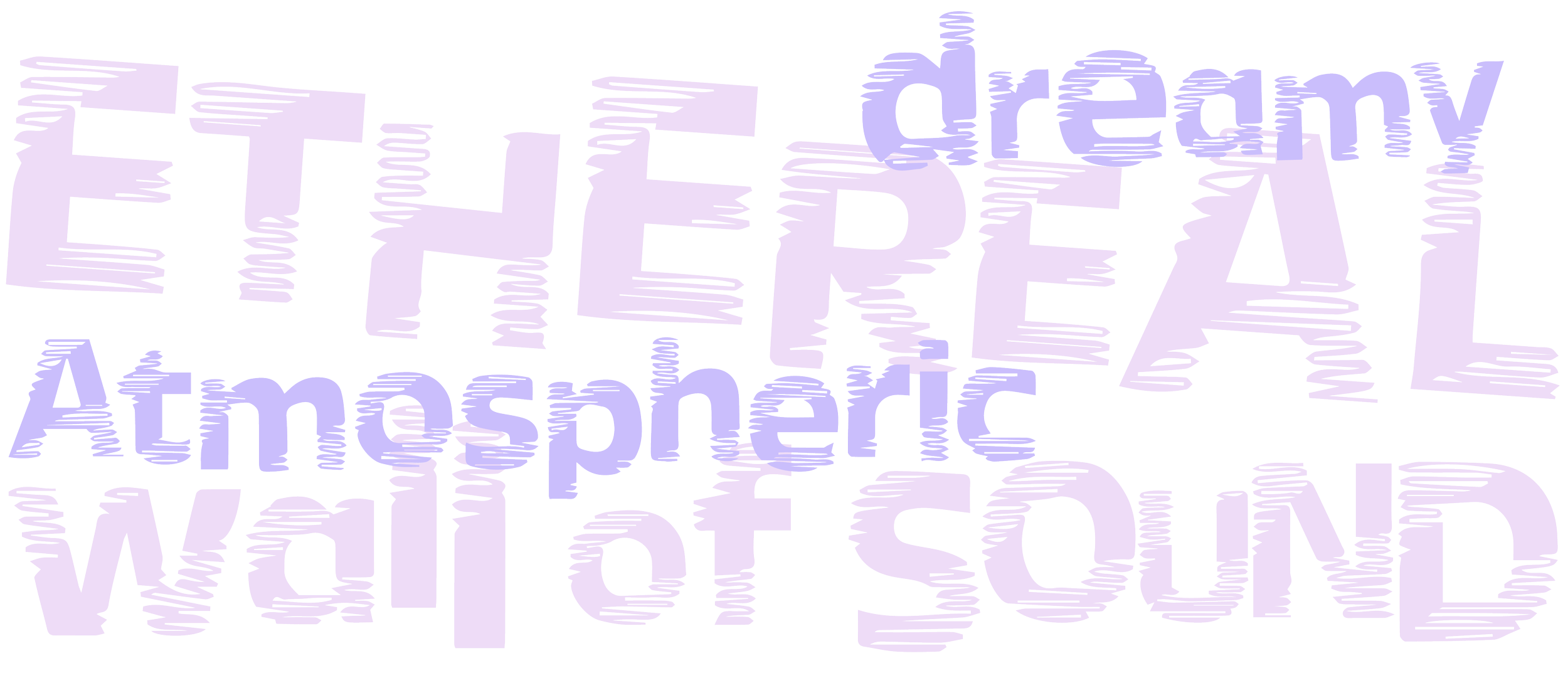
Type Modification
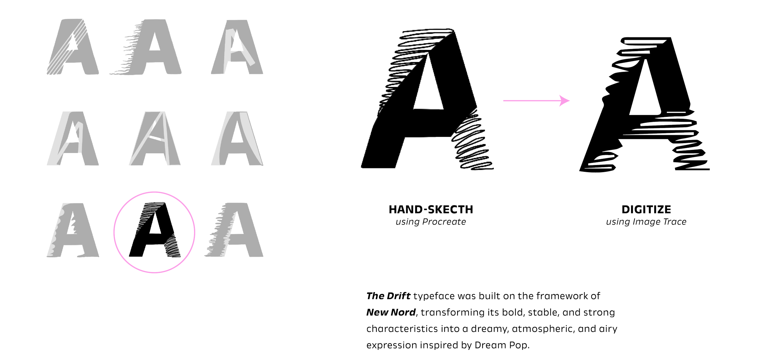
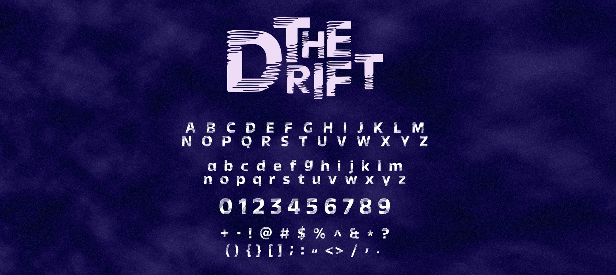
Built upon the structure of New Nord typeface. While keeping the skeleton structure of the original typeface, The Drift incorporates texture that creates visual illusion that inspires by characteristics of Dream Pop: dreamy, ethereal, movement.

Logo Development

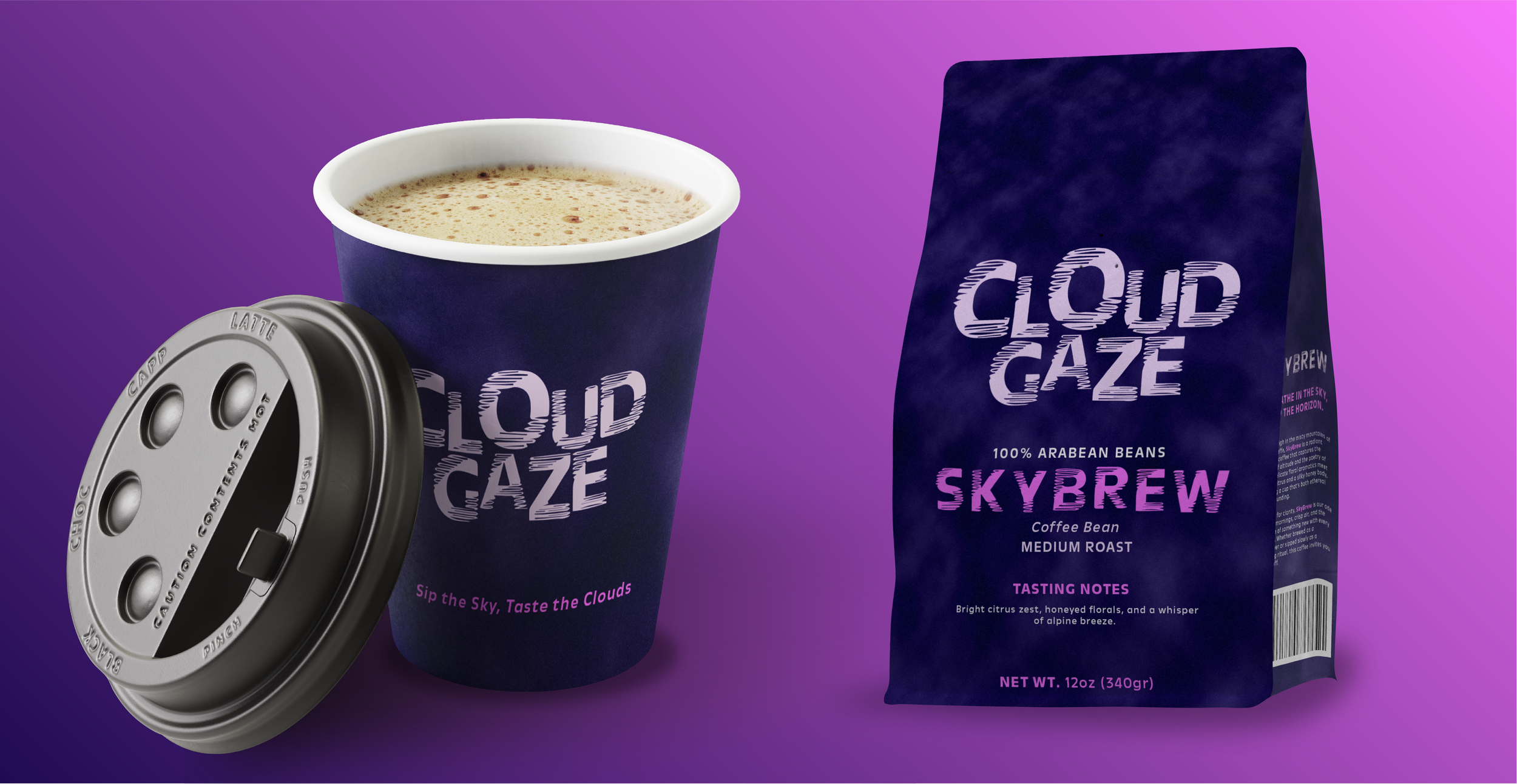
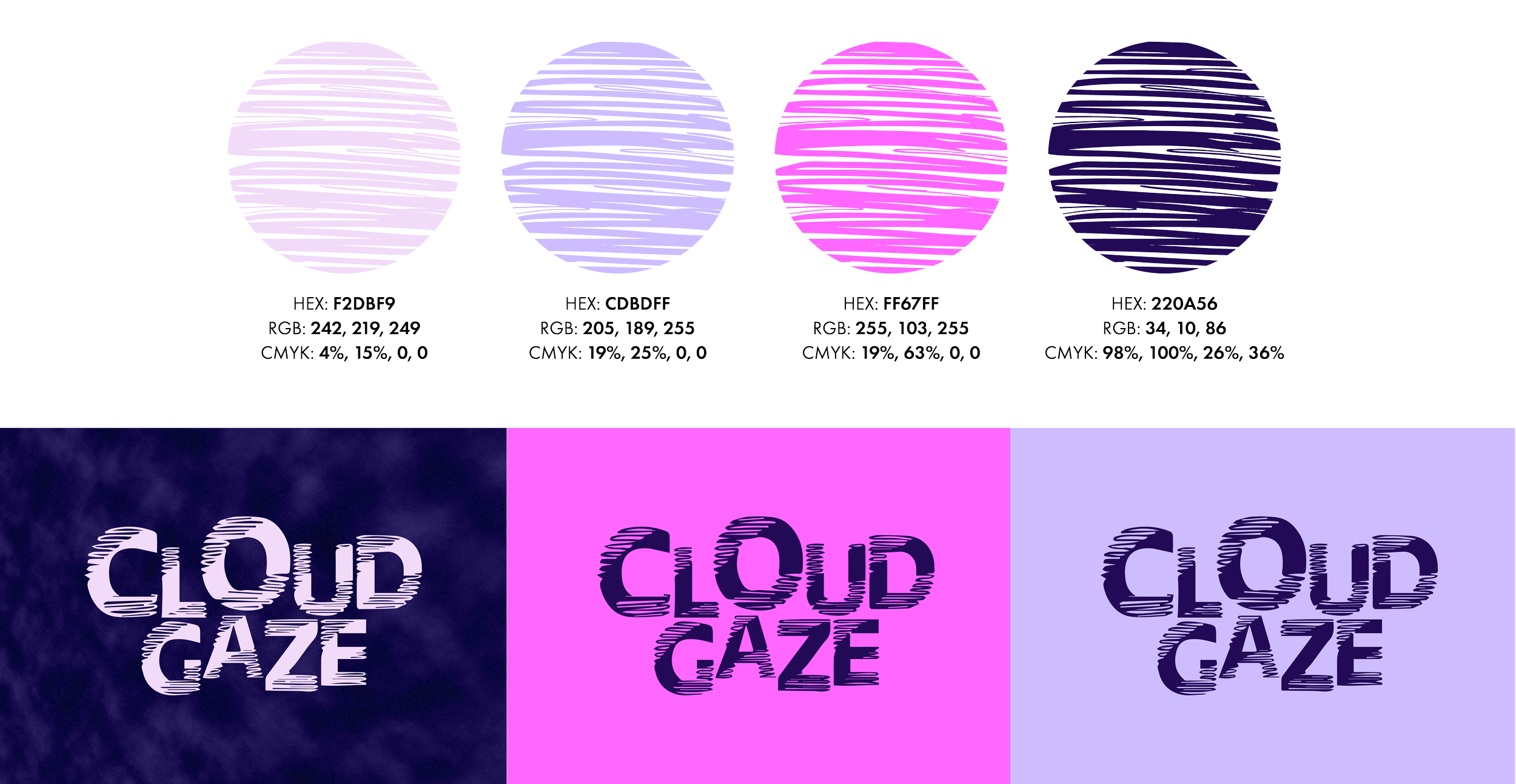
Cloud Gaze’s brand direction inspired by elements of Dream Pop. The logo is built from floating letters, in addition to the color system, shaping the brand to feel like dream.
This Type Specimen Book featuring The Drift, my custom typeface. The book illustrates the typeface’s form and function, directly linking its characteristics to the ethereal and dream-like identity of the Cloud Gaze brand.
Type Specimen Book
Deliverables
