Decode
UX/UI - PRINT DESIGN
Project Overview

Design Brief
Decode is a brand created to guide escape room enthusiasts toward the best experiences. It aims to build a vibrant community of people with shared interests by connecting them not only online but also in person through features that let users form teams and play escape rooms together. The brand’s design system captures the mysterious and playful essence of escape rooms through its distinctive graphics, color palette, and typography.
Persona
Decode is designed for escape room enthusiasts across the U.S., catering to players of all experience levels. It’s perfect for those who may not have many friends but want to meet new people who share a passion for puzzles and adventure, as well as for tourists seeking the best local escape room experiences.
Initial Exploration
The initial phase involved extensive early exploration and research. This included studying the history of escape rooms, common gameplay mechanics, and understanding the player community. I also looked at various types of puzzles, locks, and associated imagery relevant to the genre. Furthermore, I gathered data from 20 different escape room locations throughout San Diego, noting key features of each. This research informed the subsequent hand and digital sketches, which explored various quote treatments and layouts, integrating early graphic elements aligned with the emerging brand.


Color System
The color system reflects the mystery and excitement of escape games, with a diverse palette that brings energy and playfulness to the brand.
Typography System
The typography system embodies a fun, playful personality. Display typefaces feature maze-like visual elements that capture attention, while body text ensures clear legibility while subtly echoing the overall playful tone.
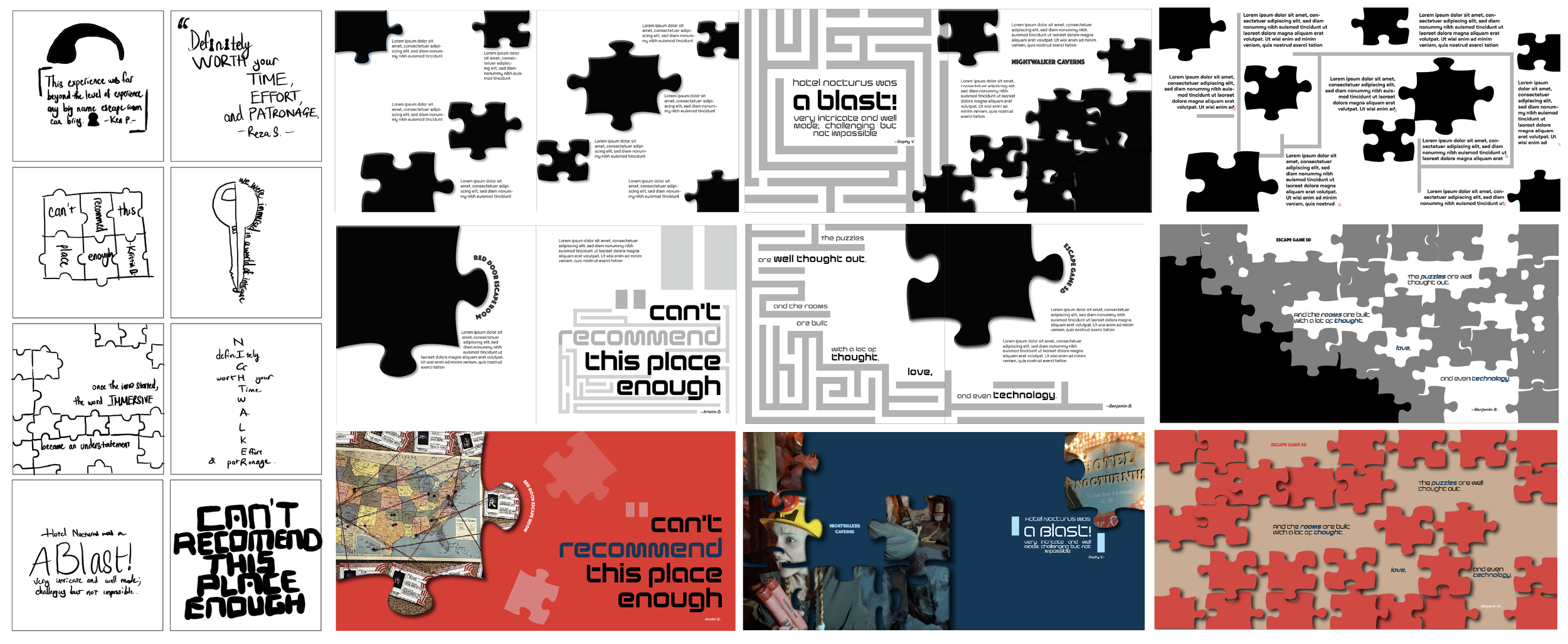
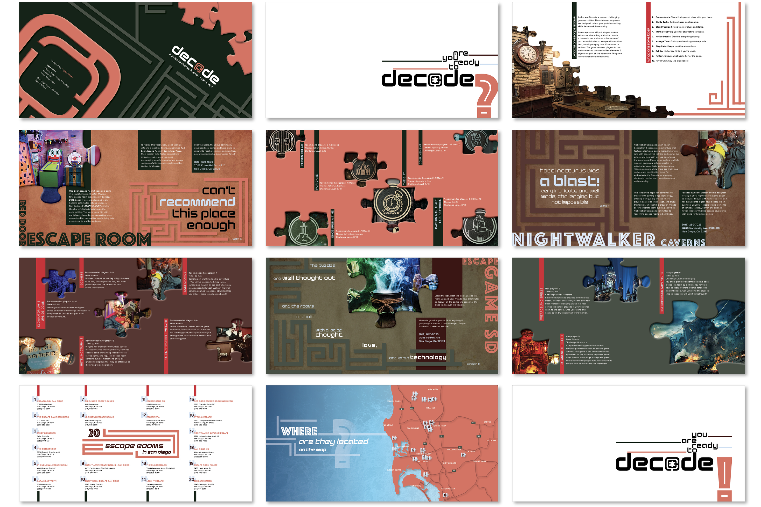
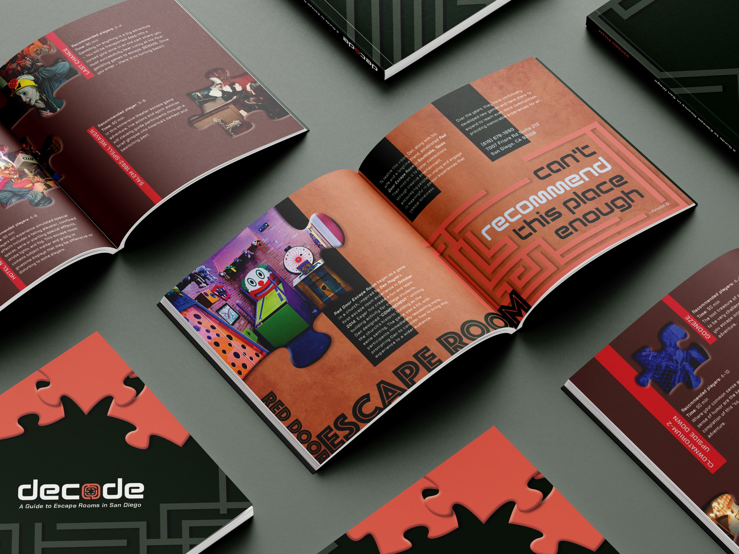
Guide Design
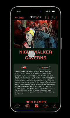
Incorporating puzzle pieces and maze patterns as its primary graphic elements, the "Decode Guide"introduces readers to the history and mechanics of escape rooms. The main content focuses on featuring three specific San Diego escape room locations.
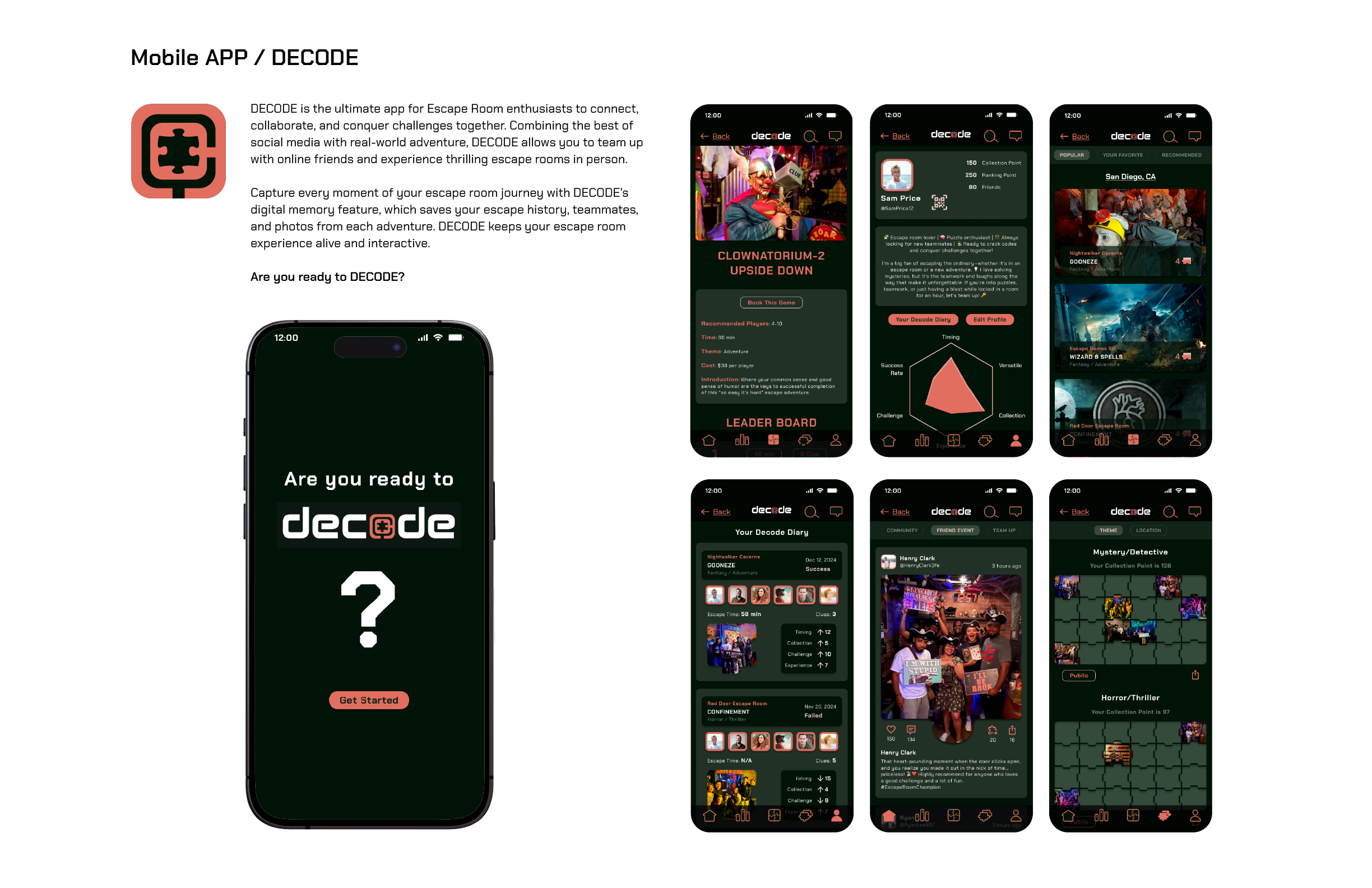
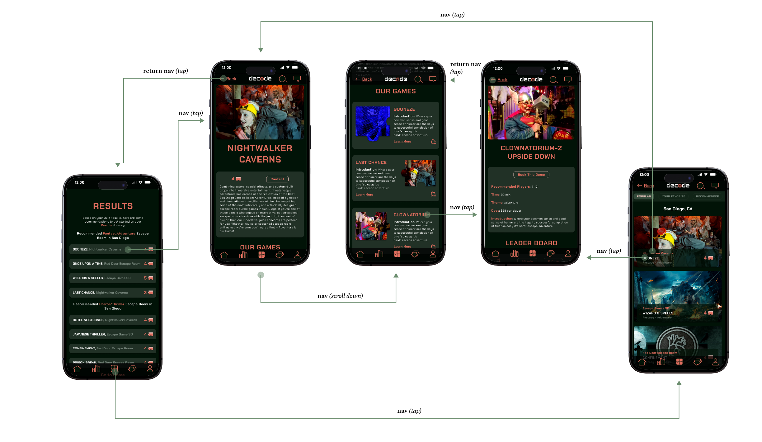
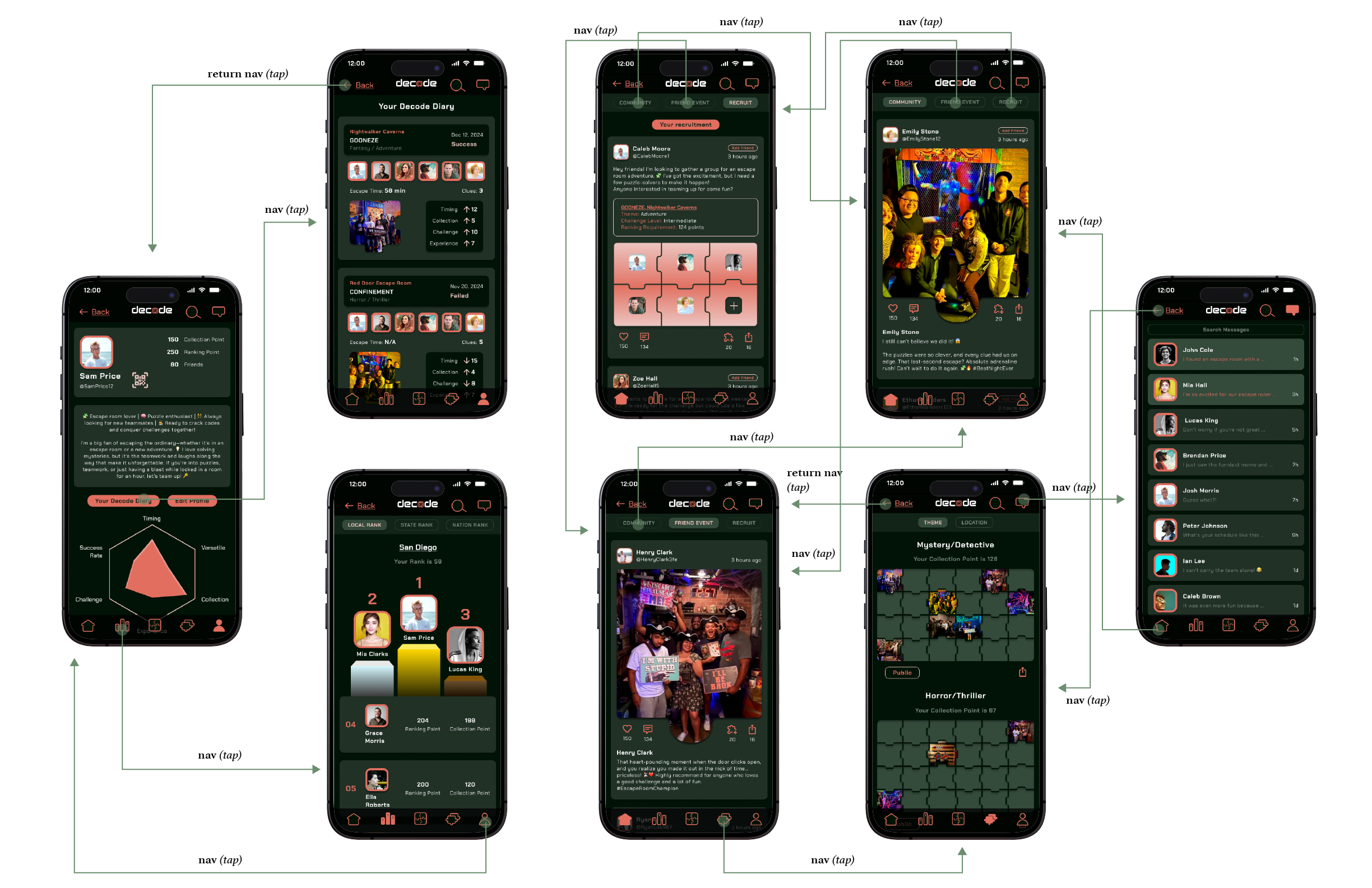
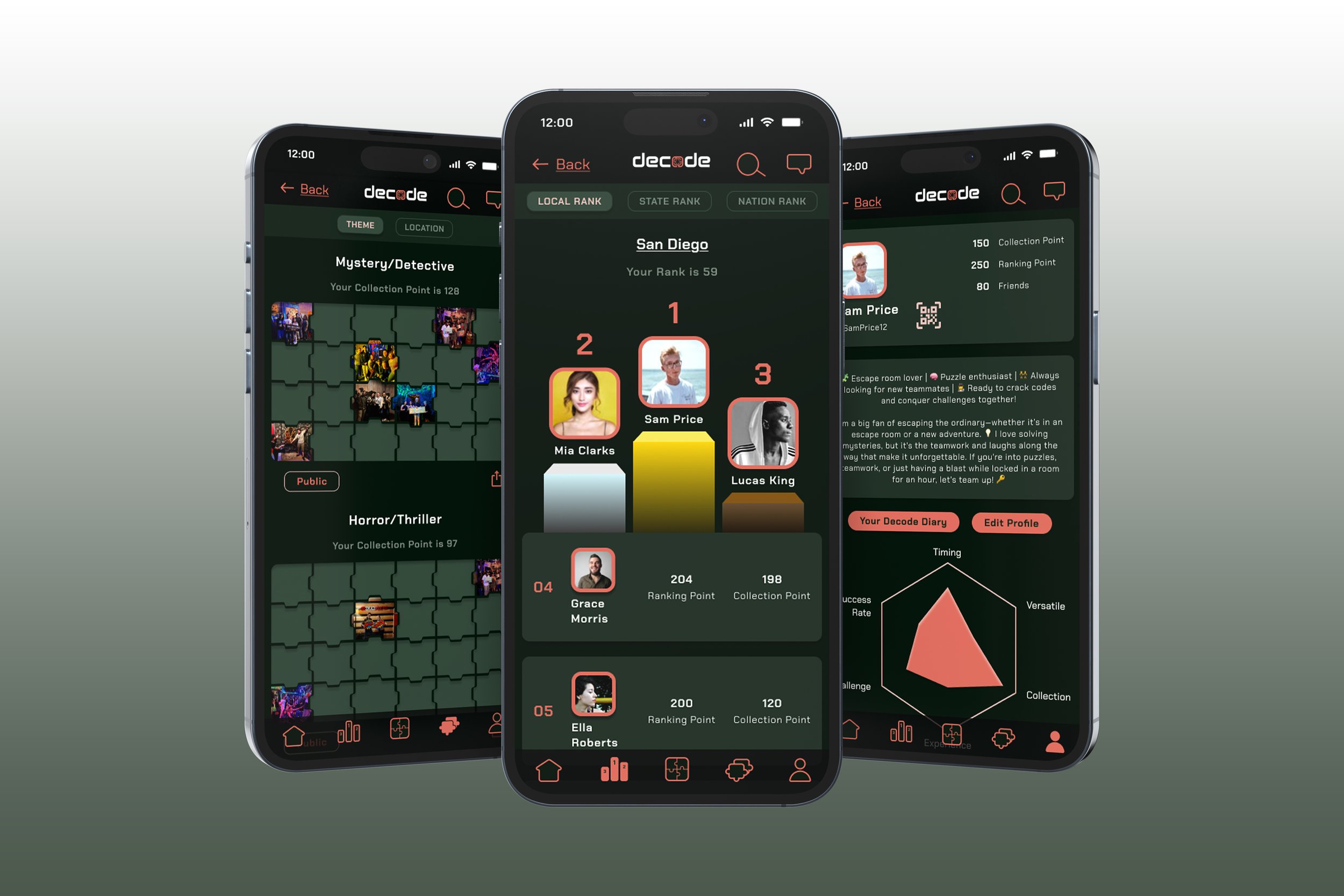
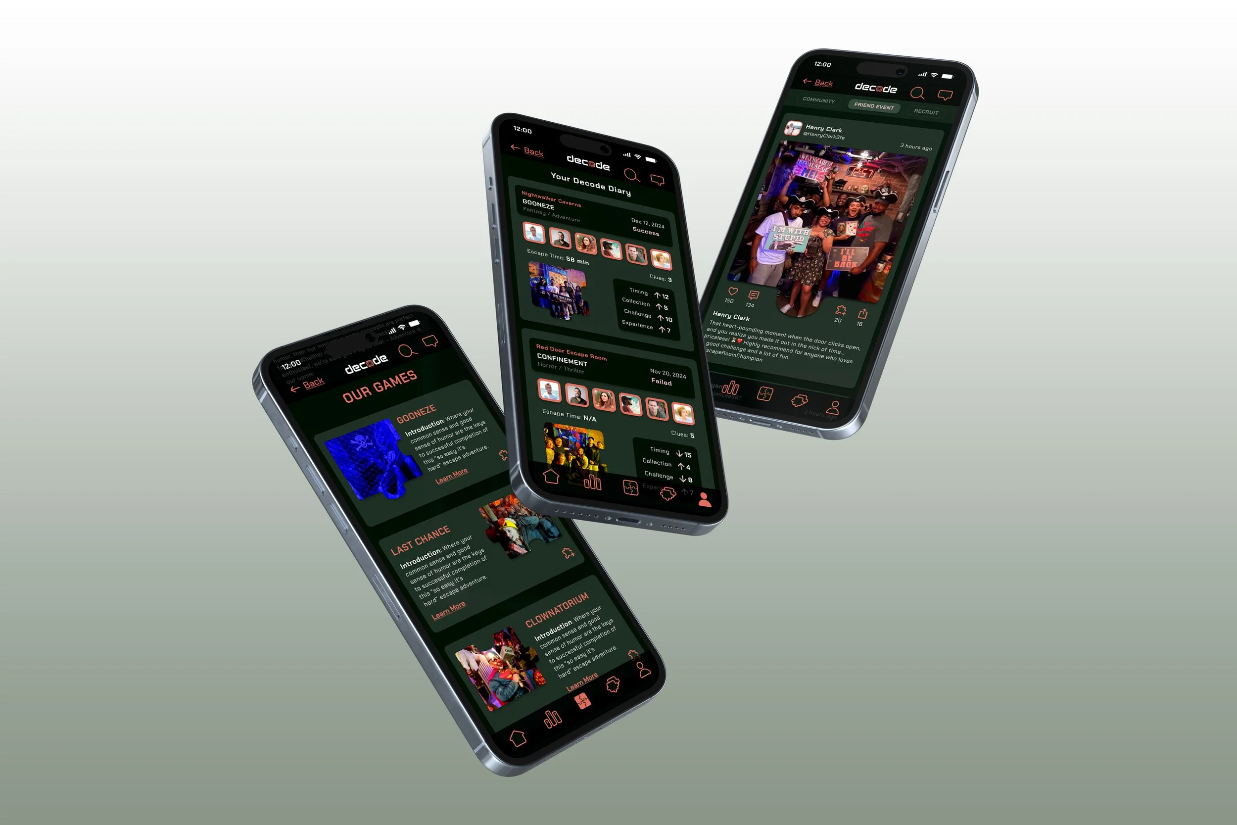
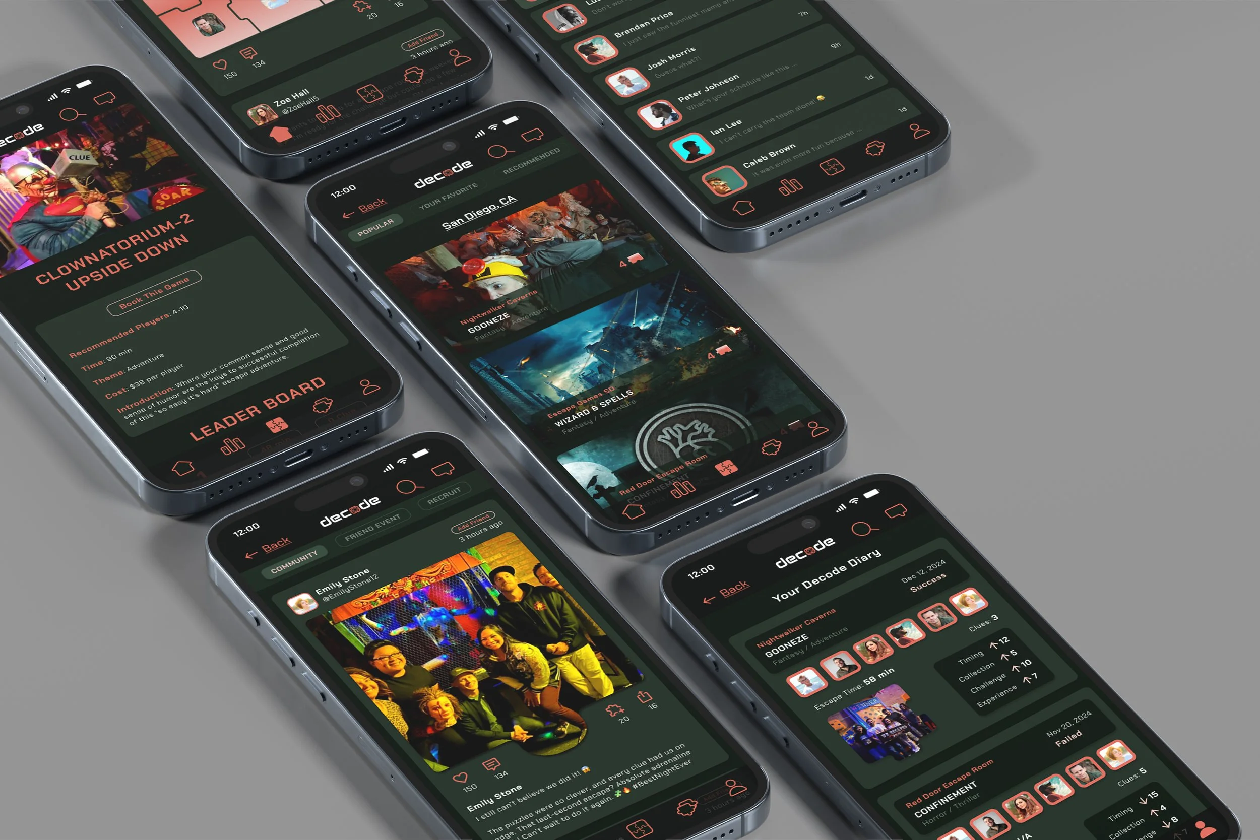
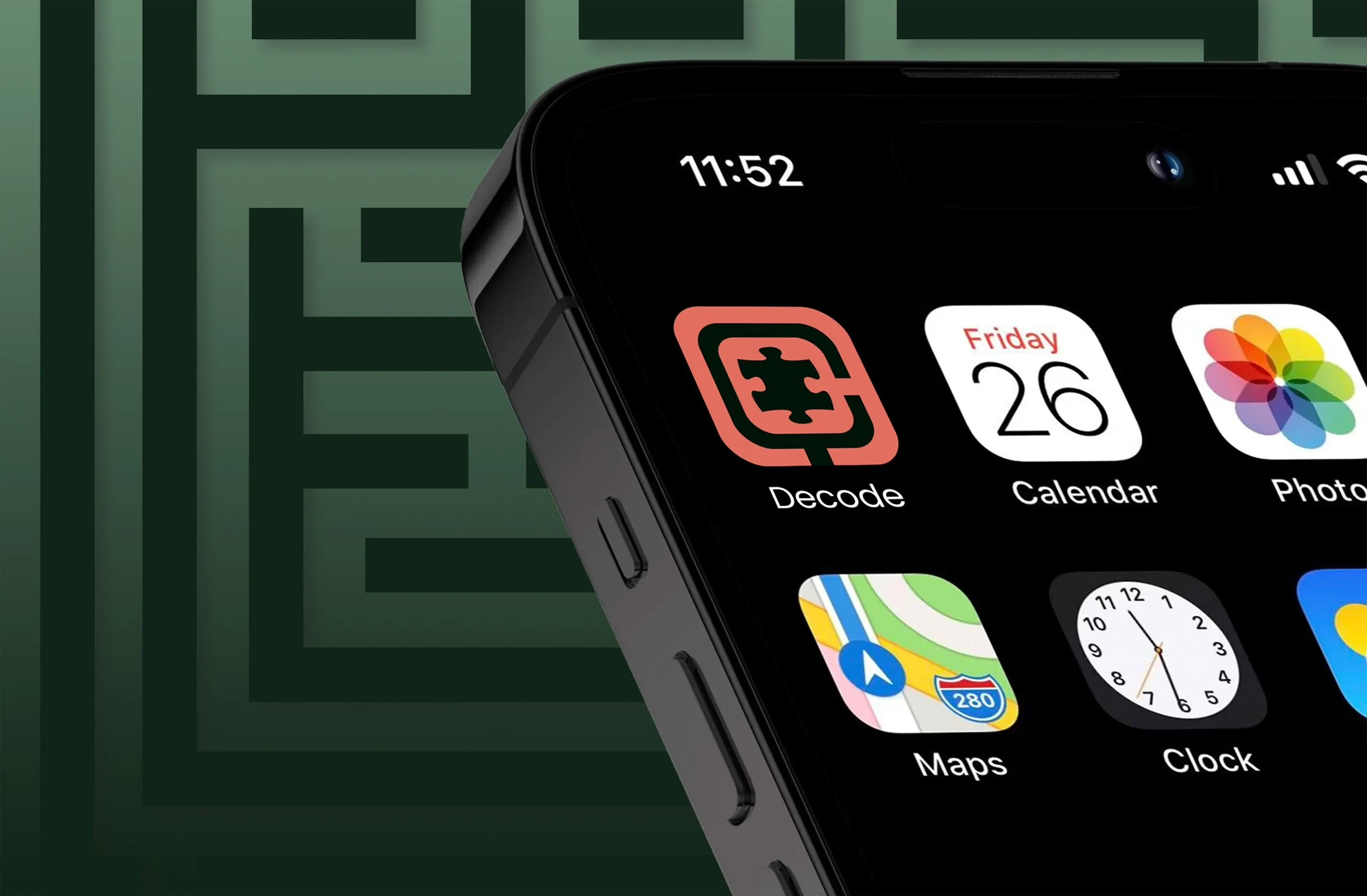
App Prototype
Aimed at escape room enthusiasts, the Decode App functions as both a community platform and a personal digital collection tracker. Its key features are designed to blend digital interaction with real-world engagement:
Social Media: Share your experiences with fellow players.
In-Person Team-Up: Connect and coordinate meet-ups for future games.
Competitive Ranking: Engage in friendly competition with a community-wide ranking system.
Collectibles: Gather unique digital items to unlock features or commemorate your successful escapes.
The app offers many other features to enhance and document every step of your escape room journey.
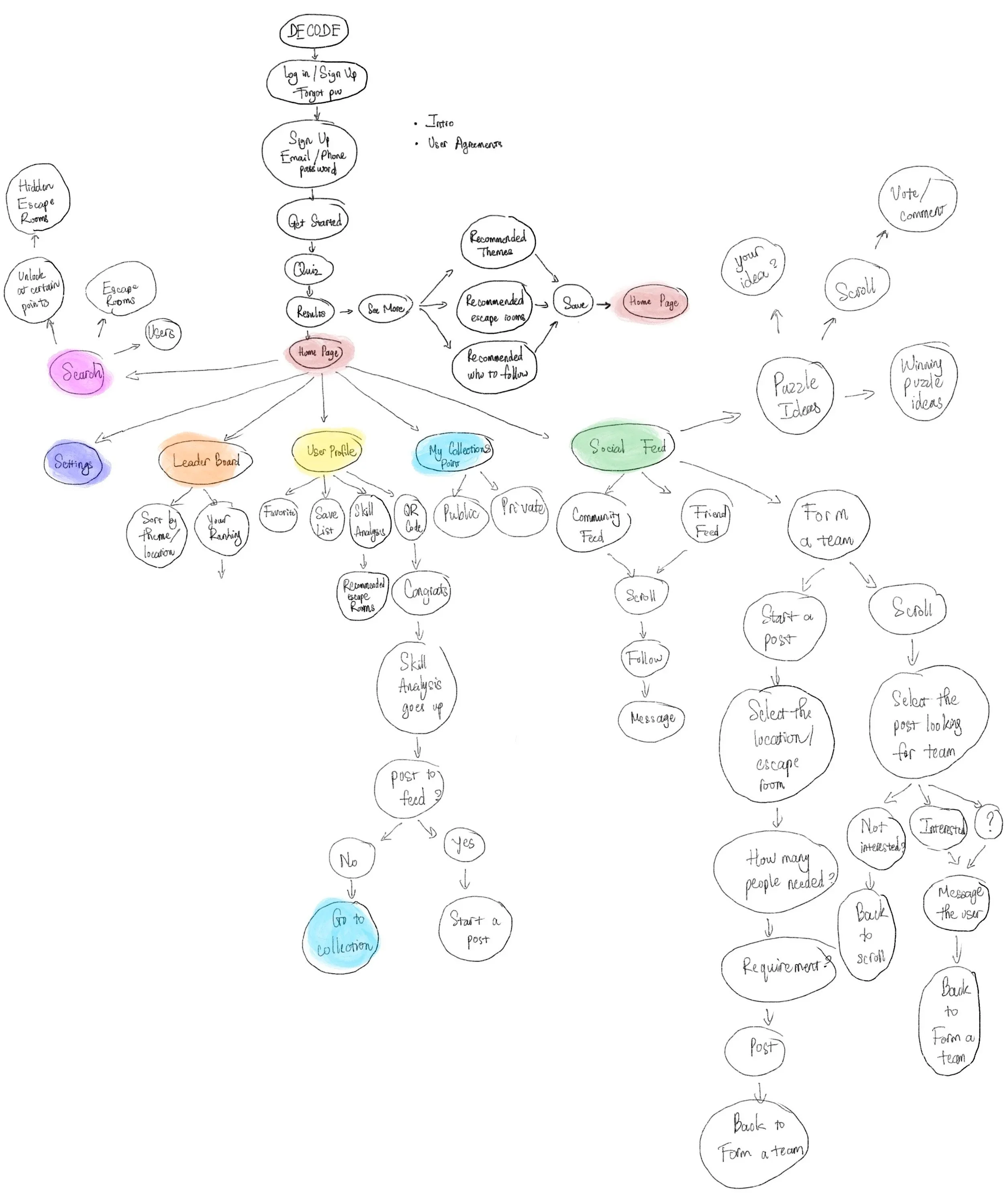
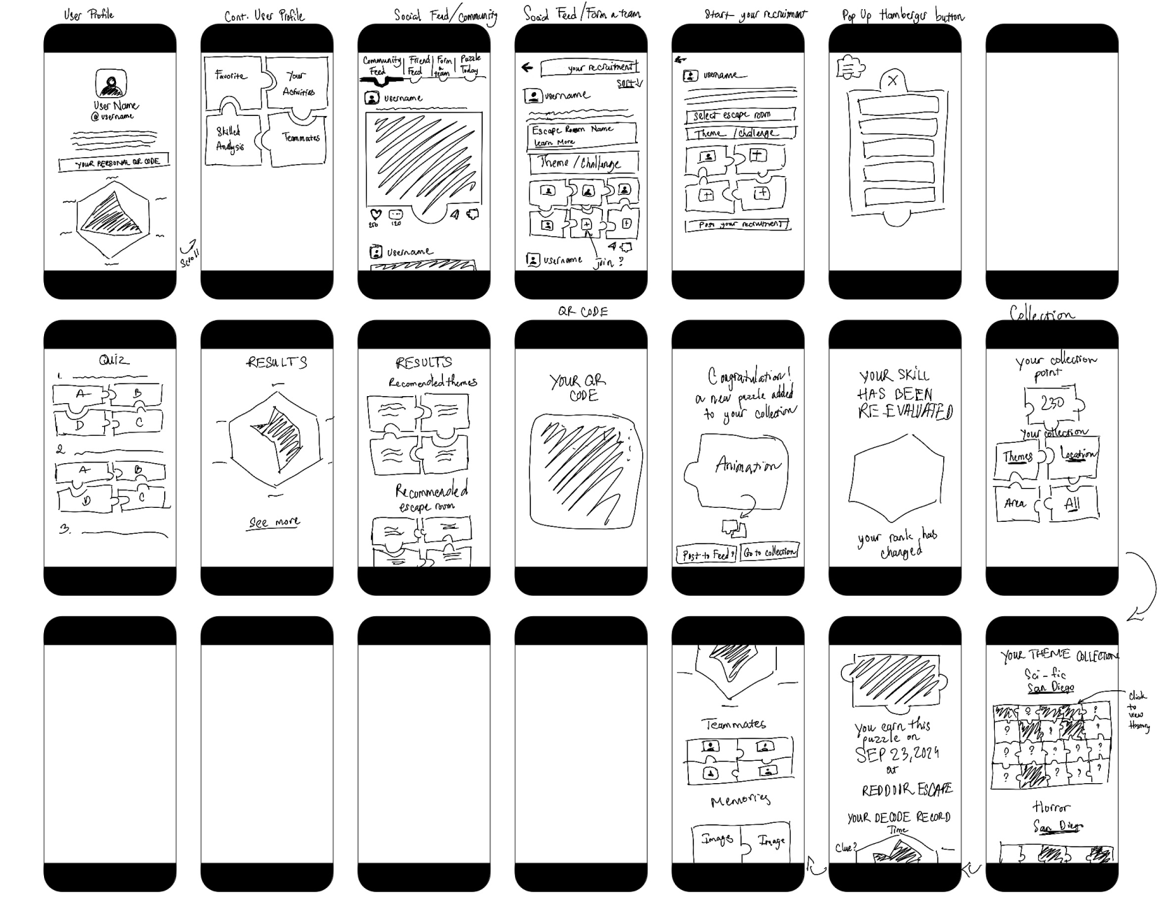
Wireframe Sketches
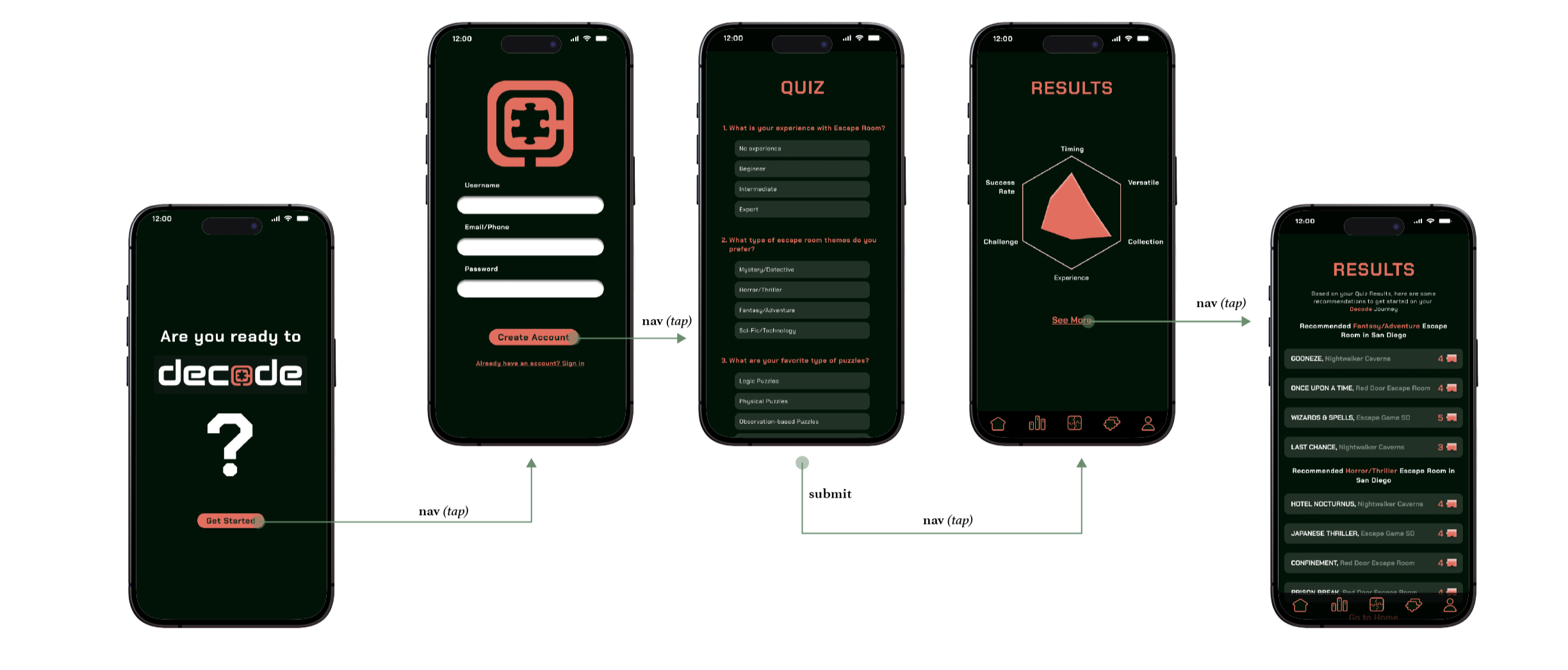
Prototype